Come on, admit it!
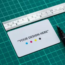
You’ve used the same bland template design for your business card for years. Once a showstopping extension of your brand your paper business cards are past their expiration and just aren’t cutting it for you anymore.

Let me help you. In this blog, I'm going to give you 8 excellent tips on how to design the perfect business card and how the new digital age of networking may be the best way for you to go.
Understand Your Brand
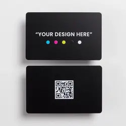
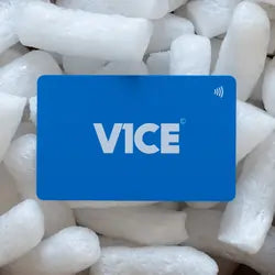
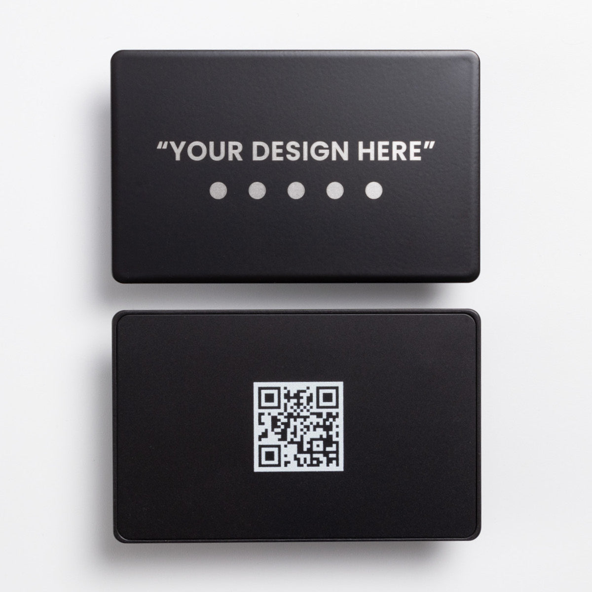
Your card is an extension of your brand. Reflect on your brand's core values, colors, and emotions it evokes. This understanding will serve as the foundation for your card's design. Think about what material you use and how that represents you. For example, SpaceX used V1CE’s Silver and BlackMetal Business Cards with the SpaceX logo showing a true representation of their brand.

Embrace Minimalism
Long gone are the days of getting everything from your name to your star sign printed. Keep it simple! While the digital realm offers endless design possibilities, simplicity often reigns supreme. A clean, uncluttered design ensures your card remains professional and easy to navigate.

Prioritize High-Quality Images
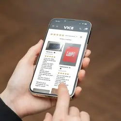
Whether it's your logo, a profile picture, or even you showcasing what you sell through your V1CE product catalogue, ensure all images are crisp and high-resolution. Pixelated graphics can detract from your card and profiles overall appeal.
Experiment with Typography
Typography can set the mood. While you should prioritize readability, don't shy away from experimenting with fonts that align with your brand's personality. But please do make sure it matches your brand's personality, nobody wants to see a child's play area being advertised with Gothic text, as much as nobody wants to see a funeral home being advertised with bubble writing. (Okay maybe that would be funny to see)

Choose Colors Strategically
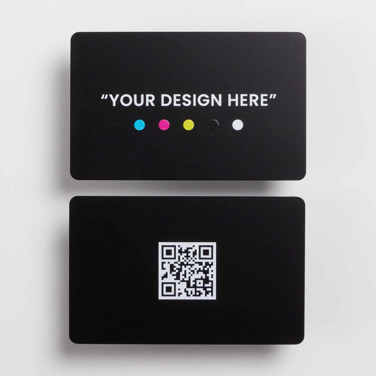
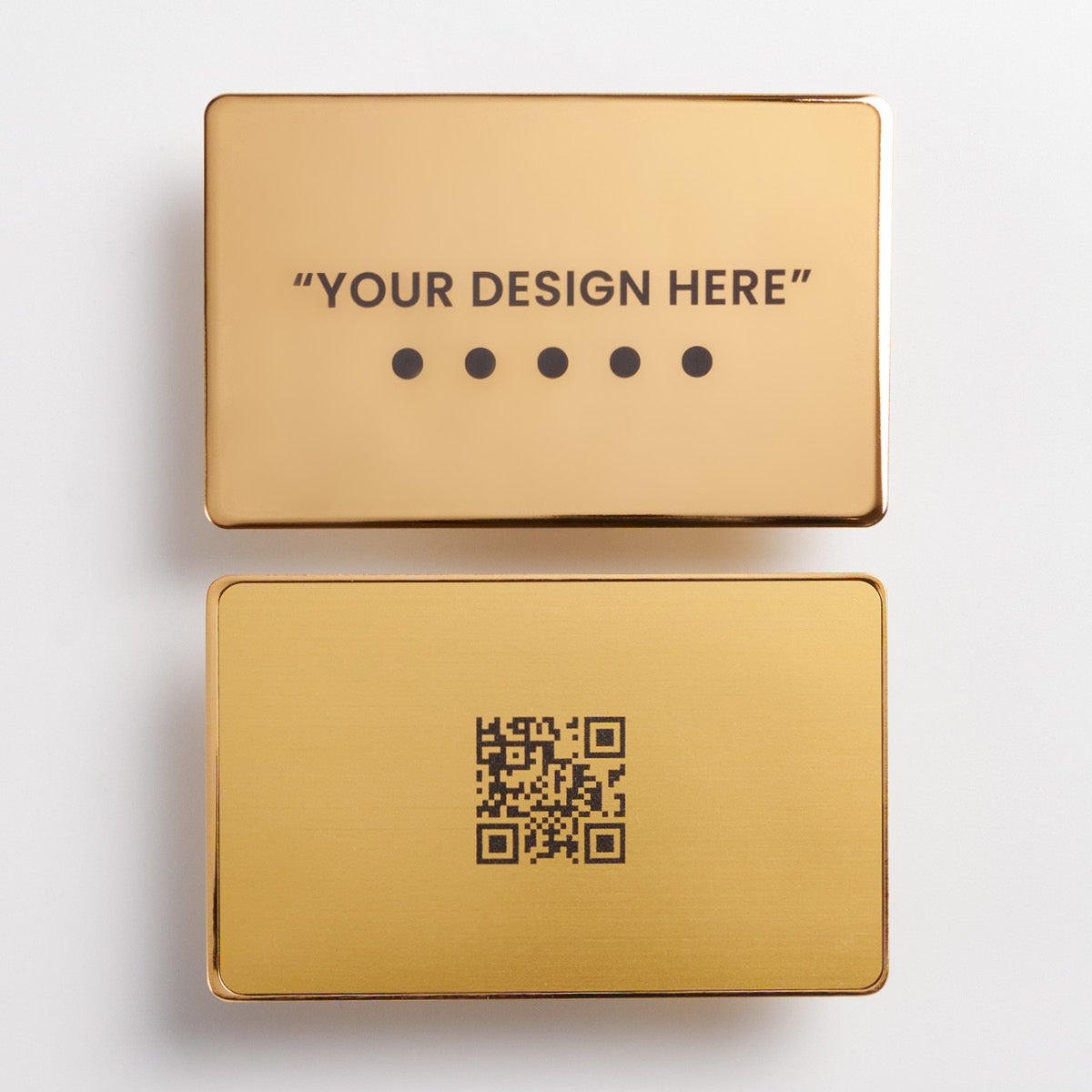
Colors can convey emotions and brand values. Stick to a cohesive palette, and remember to consider how these colors appear across various devices. See how The Ivy uses its soft pastels to match with the natural feel of their Restaurants or how Rolex used V1CE’s 24k Gold card to represent their exclusivity.
Create A Profile To Match
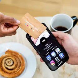
Your digital card profile is just as important as your card. Using V1CE’s full range of appearance options you can customise your profile to be just as on-brand as your card using your brand colours and upload your own logos for buttons.

Stay Updated with Design Trends
Stay up to date with V1CE’s ever-growing list of features to ensure that your digital profile is using every ability of V1CE to showcase your brand in the best possible light.
Seek Constructive Feedback
Before finalizing your design, gather opinions. Fresh perspectives can offer invaluable insights and refine your card's design. V1CE’s design team is on hand 24/7 to help you ensure that your card is perfect for you. Our team knows a thing or two about designing business cards so if you ever need help just reach out and ask. They will be happy to assist.
In conclusion, the digital business card is more than just a digital version of its paper predecessor. It's an opportunity to showcase your brand, professionalism, and forward-thinking approach. If you're looking for a platform that offers versatility and design support, V1CE is worth considering. With three distinct card types catering to various needs, 24/7 access to designers, and a suite of interactive features, V1CE ensures your digital business card is not just a tool, but a statement that resonates and impresses.
